Film Poster Analysis
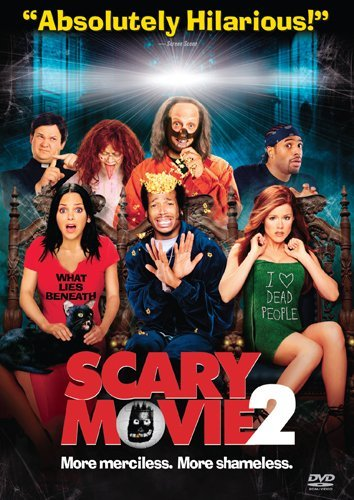
Scary Movie 2 is a 2001 horror/comedy film. This movie is about 4 teenagers, convinced by a professor to live in a haunted house, and they start to encounter strange things so they decide to get rid of the ghost. In this film poster, there are seven characters shown. Two of them looks weird looking, suggesting that they are portrayed as the ghost or a weird creature in the movie. The man in the middle looks scared and the two ladies sitting next to him looked shocked. On their t-shirts there are text written on them such as, 'I love dead people' and 'what lies beneath'. The saying 'I love dead people' is almost showing sarcasm and irony (linking to the comedy aspect of the movie) as the movie is based on ghosts and the horror theme, and the character is supposed to feel scared. The background colours are dark (navy blue and black) which matches the theme of the movie. These dark colours give off a spooky vibe. At the top of the film poster, it looks like there's a door or window opened with a bright white light shining through it. Although white can resemble peace, in this context, the colour white can represent spirits, spookiness and death. There are also white spiderwebs around the characters, and this may apply that they are trapped in the haunted house. There is a cat sitting on one of the women. A black cat is specifically used to associate witches, bad luck and even death. As many of the audience know about this superstition of a black cat, they may question what will happen in the movie. The movie name is written in a big, bold font coloured red. Red symbolises death, danger and blood, implying the danger the characters may be in when they are trapped in the haunted house. Instead of writing the 'O' in the 'Movie', they coloured it white and added a drawing of a monster. This looks like a child's drawing of the monster, linking to the comedy theme. The movie can be watched for 18 year old and older. The target audience for this movie would be 15-40+. I started the age range at 15 because some teenagers may enjoy watching horror as well as comedy and it can be entertaining. Even though you should be 18+ to watch the movie, in my opinion it wouldn't be that scary to younger viewers (15+) as it has a comedy aspect to the movie, making it scary but funny as well. At the top centre of the film poster, it says 'Absolutely Hilarious'; another feature that suggests it is funny, so it would be suitable for teenagers. I ended the age range at 40 as some elderly may not enjoy watching these horror comedy genres, whereas young adults would be more intrigued to watch it.
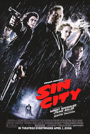
This movie is a 2005 action, crime, noir film. This movie is about an investigation at a gloomy city called Basin City, and three of its citizens are all involved in violent corruption. In this image we can see five characters. Three of the characters are holding guns, indicating this movie is filled with violence and action. Their facial expressions look focused and serious as if they are trying to shoot something, also suggesting that the movie has violence in it. The lighting is bright and is focused on all the characters. The colours used in this poster are neutral colours such as black, white and grey. These colours are dull and vague colours, and they may associate with death and mystery. The movie title is written in a bold, big red colour, to show the danger, bloodshed and violence; represents the crime genre. The target audience for this film would be ages 18-30. I chose this age range as the movie age rating starts at 18 as it portrays violence. 30 year old adults would be interested in watching this due to the action and noir genre.
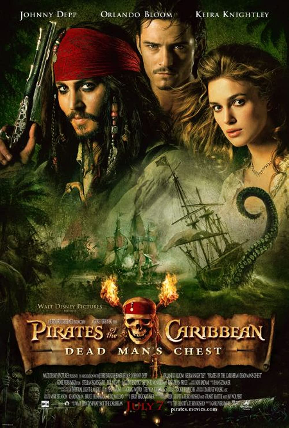
This movie is a 2006 action and adventure movie. The story line might be about pirate adventures. This image shows three characters from the movie. One of them is a pirate, holding a gun, indicating that there might be some violence and some type of action involved in this movie; relating to the genre action. The lighting in this poster is dark indicating mystery and spookiness. The pirate may appear to be a villain based on the skull, which is a sign of death, and the pirate has a distinctive appearance in comparison to the other characters in the poster. The white, thick fog in the middle suggests trouble, worries and low awareness to reality. This links to the film poster as the stereotypical view of pirates is trouble and fighting and stealing money from chests. The people would worry if they would would get robbed from the pirates. The target audience should be ages 12-30. I started the age range at 12 because pirates are childish so it would be suitable for younger age children. Although pirates may be childish and age rated 13, adults may find it entertaining to watch.

This movie is a 2004 romance/musical film. In this film poster, there is a picture of two people, which may appear to be the main characters in the movie, and we can infer that these two characters are in a relationship. The movie title 'Bride and Prejudice' is coloured in gold, symbolising wealth. This links in nicely with the story line as there are wealthy men shown in the movie and is about someone looking for marriage. In the film poster, there is a man from a White background and a woman that looks like she's from an Asian background. The word prejudice is used in the movie name and this defines an unfair feeling of dislike for a person because of their race. In the image, we can also see that the two races are divided by the two main characters in the picture. We could imply that there could be some sort of racism or problems between races involved. Stereo typically Asians are supposed to marry Asians however this movie could show an interracial marriage and can promote unity between races/cultures. The target audience could be ages 12-50+. I started the age range at 12 as when young children start developing into teenagers, they start to interact with other races and communicate with them properly. This movie could potentially show them that it is okay to be with other races and prejudice is strongly not accepted. I ended the age range at 50 and above (adults over 50 can also watch) as they may find this movie amusing and enjoyable.
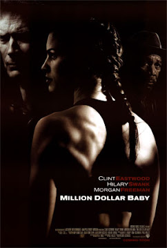
This movie is a 2004 drama/sport film. We could may suggest that this movie could be an action movie due to the serious facial expressions. In this film poster, there are 3 main characters. The lighting is very dark and it can imply some mystery or some type of downfall in the movie. The story line might be about an independent woman being trained for fights and competing against others. The target audience could be 12-50+. I started the age range from 12 years old because it may inspire younger teenagers to participate in sports. In the film poster, the main character is a woman, so this could potentially inspire young girls to also play sports. I ended the age range at 50 as adults may also enjoy this genre and interesting.

Comments
Post a Comment